Unboxing CSS Grid
11 December 2017
The tools available to developers to create beautiful and functional website layouts are constantly being improved and reinvented. The latest technique, CSS Grid, aims to make it easier to build layouts with complex arrangements of differently-sized blocks.
Up until now some of the trickiest layouts to make work in responsive designs have been those where blocks (which might also be called tiles or bricks) don't sit in neat table-like rows and columns. Think of how pieces in the game Tetris slot together, and you'll begin to see how when the width changes you can't just wrap the blocks under each other without leaving awkward gaps.
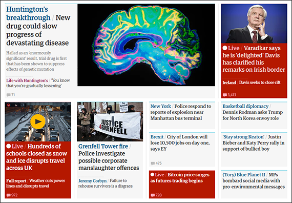 The most common types of site that have this problem are content-heavy. They typically have many articles and features that change regularly and include lots of images and multimedia. News sites such as the BBC and The Guardian are a classic example, and so it's known as a 'magazine' layout.
The big advantage of CSS Grid is that makes it much more straightforward to code complicated magazine layouts, without them falling apart when the available space changes. Blocks can be made to shift around and change size and shape to fill any gaps.
The most exciting advances in web tools both open up new ideas that weren't possible before, and also make those that were possible more cost-effective and efficient to do.
For this reason we're looking forward to when support for CSS Grid, which is already available in the latest browsers, is broad enough that we can put it in our toolbox. We think it's likely to stay there for some time to come.